
A Coffee Ordering App

Duration
5 weeks
Platform
IOS
Role
UI/UX Designer
Tools
Figma
Project Overview
Context
74% of Americans depend on coffee every morning to get their day started. Whether it's a comforting daily brew or an adventurous exploration of Arkadia's flavorsome offerings, Arkadia Coffee & Tea is committed to leaving a lasting impression on each and every customer who stops by. This was a concept project for my UI/UX Design course, Thinkful.
Problem
Today people are on a strict schedule. Whether it's going to work, or trying to make it on time to their 8 a.m. class, customers consistently find a way to carve out moments in their busy day to pay a visit to their beloved local Arkadia store. Although people enjoyed the traditional coffee shop experience, they were missing out on convenient time-saving features like ordering ahead. The company also wanted to establish a way to give back to their customers.
Solution
I designed a coffee app that allows customers to order ahead, enjoy customization, and reward the Arkadia family.


Final Prototype
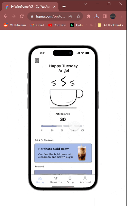
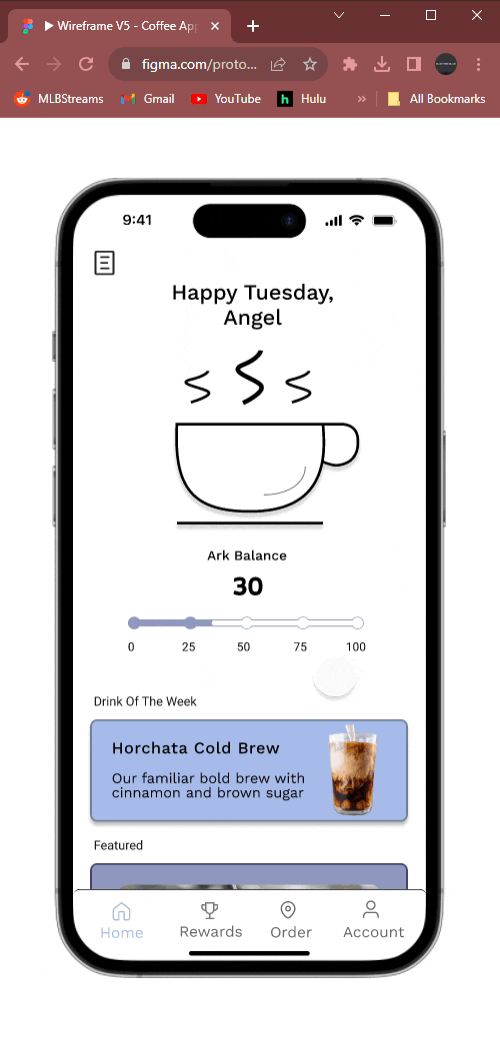
Home Screen
Rewards
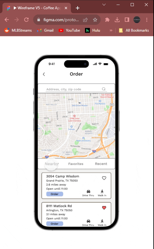
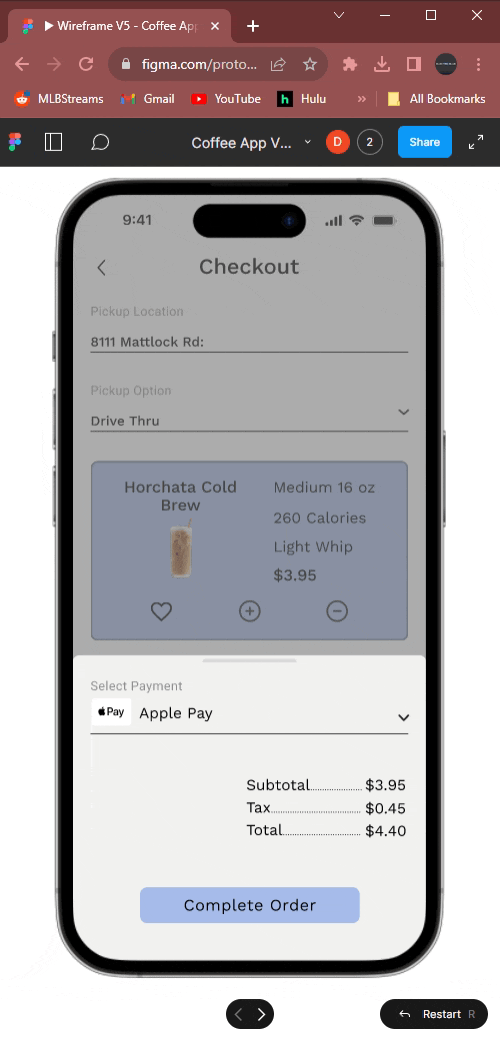
Ordering
Customizing
Research Analysis
Competitive Anlysis
I am a part-time Starbucks barista so I did have some insight into the coffee business, but I still had more questions. I conducted two different research methods. First, I went to the app store and looked at the 1-star reviews for applications like Starbucks, Dutch Bros, and Dunkin. This gave me insight into what customers are frustrated with on their favorite coffee app so that I can improve on my competitor's errors. Then I wrote a list of questions I would include in a user survey to gather more information.

Users lacked an order ahead feature

Most popular, users liked the way the app flowed.

Users found it difficult to navigate
User Survey
Once I completed my user survey, I posted it on several Reddit forums and got 36 responses.

Questions
-
Discover what the biggest selling point of a coffee app is
-
What do users expect in a coffee app?
Findings
-
People enjoy the feeling of being rewarded
-
88.9% of people pick up their coffee through drive-thru
-
Users want calorie content to update when modifying their drink
Personas
After my week long research sprint, I Created 2 personas and several user stories to target the best experience for our users

Design Process
Site Map
With the help of my user stories, I wanted to create seamless flows throughout the app. The user's experience flow must be carefully designed. After creating enough flows I began crafting a site map. The sight map gave me an overall view of how the app will flow throughout the whole process.

Design Process
Wireframing
Once I completed my flowcharts and site map I was ready to begin wireframing. Before drafting wireframes I went back to gain inspiration from my competitors.
Low-fidelity
Despite having a few ideas sketched out on paper, I hadn't yet become fully committed to a single concept. I still wanted to bring these ideas to life through Figma
-
Allows me to iterate and conceptualize faster
-
Provides a clear overview of page structure
-
Gives me a visual of my ideas


Mid-fidelity
For my upcoming iteration of wireframes, I aimed to experiment with font choices, spacing adjustments, and text size variations.
-
Played around with the font, size, and space
-
Created a few vectors
-
Gives me a better view of what the final product could look like


Design Changes
Prior to my third iteration of wireframes, I felt it was essential to thoroughly assess my existing work and identify areas for improvement.
Develop
-
Look back at user stories
-
Analyze my personas
-
Do a few rounds of user testing


Refinement
-
Adjusted font and type size
-
Altered the design of the Nav Bar
-
Included a customize button for drink orders to display further customization


After a few rounds of user testing many users were confused with the view menu button. Many of them were trying to place an order and were puzzled when that app wouldn't let them. Users also said it felt crammed with the addition of the search bar so I removed the nav bar and made the page a slide-up window instead.


Design Changes Continued
Users wanted to be able to reorder a drink easily without having to go through the entire order process, so I added a recent order screen. I also added an order confirmation screen since during the tests users wanted an ETA on their drinks.
Order History
Confirmation Screen
Reflections & Takeaways
Though I had some familiarity with the coffee shop experience I realized I didn't know enough to design a app. Doing a competitive analysis and multiple rounds of user testing helped me refine the product to a usable design that meets user needs. During the project length, I played around with creating a design system but didn't complete it as it would've interfered with my deadline. If I were to start this project today with more time I would definitely look into completing a design system and spend time creating better graphics and vectors for the app.